Brand
StoreOS brand assets
The logo, colors, and usage rules for StoreOS. Copy a hex value, download an asset, or grab everything as one zip.
Download all assets (.zip)Logo
Wordmark
StoreOS doesn't have a standalone icon mark yet — the logo is set text. Use the wordmark below wherever a logo is needed.


Do
- Use the wordmark as-is, including the dot
- Keep clear space around it roughly equal to the dot's size
- Use a white or reversed version on dark backgrounds
Don't
- Recolor it outside the palette below
- Stretch, skew, or add a drop shadow
- Outline or gradient the text
Patterns
Poster backgrounds
The topographic line pattern used across social posters. Light version on lavender for feature/educational posters, dark version on navy for product-screenshot posters.


Light poster surface
- Background lavender: #ECE7F4
- Contour line: #CDD0DB
- Headline text: #04141A (near-black, not pure black)
- Accent dot: Emerald #57CC99
Dark poster surface
- Background navy: #030A17
- Contour line: #1E2A3D
- Headline text: white / #F4F4F5
- Use for product-screenshot and app-mockup posters
Patterns
Poster samples
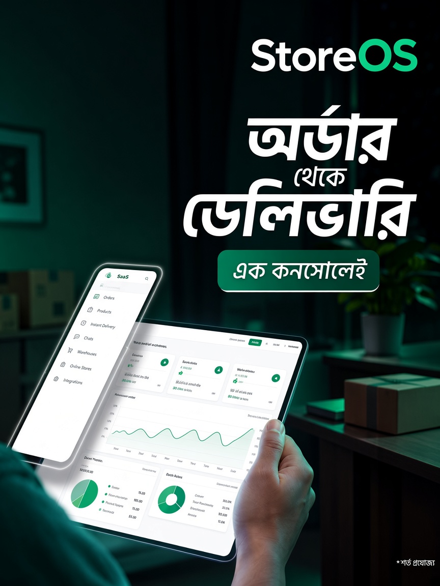
A blank base to start a new poster from, and a finished example showing the format applied.

Patterns
Lifestyle scene posters (planned)
A third poster direction we like: a grass/landscape scene with product or app mockups floating over it. No StoreOS asset in this style exists yet — this is a brief for whoever designs it, not a download.
What to include
- Soft outdoor / grass-hill scene as the base, full-bleed or as a grounded mound
- Console or storefront UI cards floating above the scene, slightly overlapping
- Headline in the site's display font, one word or phrase picked out in an accent color
- Short 3–5 item feature list under the headline (e.g. Website · Inventory · Orders · Courier · Payments)
- StoreOS wordmark top-right or bottom-left, plus a one-line CTA
Use StoreOS colors, not the reference's
The reference posters use a purple accent word (roughly #A57EED) — that color is not part of the StoreOS palette. Pick out the accent word in Emerald or Primary from the palette below instead, and keep everything else (grass scene, floating UI cards, layout) as the reference.
Homepage
Sky background and guide lines
Two elements unique to the homepage hero and docs — not used on posters. The sky is an animated gradient in the live site; this is a static reference image.

Guide lines over sky
Vertical guide lines
Thin rails on either side of the content column
Sky colors
- Light mode top: #94CCFA
- Light mode bottom: #E0F0FF
- Dark mode top: #0F1F4C
- Dark mode bottom: #29427A
Guide lines
- Two thin vertical lines flanking the page content
- 1px wide, near-black at 8% opacity
- Content column caps at 1152px wide
Color
Palette
Click any swatch to copy its hex value. Primary is the only color allowed on CTA buttons in light mode — see design.md in the repo for full contrast rules.
Neutrals
Type
Typography
All three typefaces are free on Google Fonts. Click a card to download it, or copy the embed code below to add all three to a webpage.
Display — Plus Jakarta Sans
Aa Bb Cc 123
Poster headlines, oversized footer wordmark.
Get on Google FontsEmbed code (for a website)
<link rel="preconnect" href="https://fonts.googleapis.com">
<link rel="preconnect" href="https://fonts.gstatic.com" crossorigin>
<link href="https://fonts.googleapis.com/css2?family=Geist:wght@400;500;600;700&family=Geist+Mono:wght@400;500;600&family=Plus+Jakarta+Sans:wght@400;500;600;700&display=swap" rel="stylesheet">